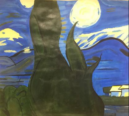
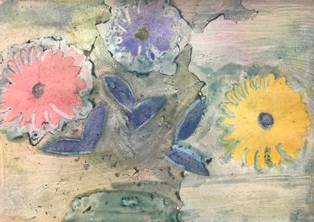
painting in style of artist
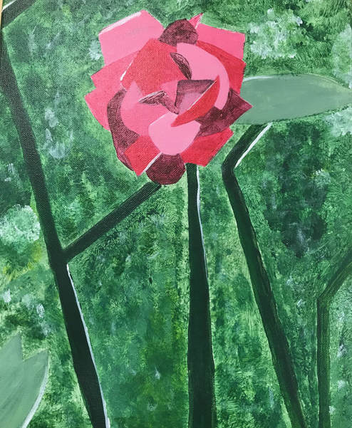
- The artist I referred to for my painting was Alexander Rodchenko. The four main ideas I took from my research was geometric shapes, simplism regarding detail, random lines, and different shades of a color.
- I think my piece is neat and well executed. The definition of my lines/stems could be fixed a little because they're not very straight but overall I think they look good. I think the different shades of red in my rose came out nice. I like the patchiness and variation in color of the background.
- The most difficult part of this project for me was making this painting look simple but not boring and getting the coloring right. I thought having just the rose and a plain green background would be too simple so I added different colors of green into the background to show it was in a garden. I used different shades of red to show individual rose petals and I used different shades of green to differentiate between the leaves, stems and foliage in the background. Overall I think everything is distinguishable without looking messy.
- For the rose, I chose different shades of red for the petals. Rodchenko uses different shades of a color to distinguish shapes in his paintings. In his artwork, there is usually one color dominating the painting; I chose green to be the majority of my painting but used different shades of green so it didn't look uniform.
- Alexander Rodchenko mostly painted just shapes but some of his pieces use shapes to make up something such as a person or a wave. I used different shapes such as triangles and rectangles to make up my flower petals.
- If my artist could see my painting, he'd probably say that it wasn't simple enough. He would also say that it needs more defined shapes in it.
- If I were to do this project differently, I'd be more precise with my painting of the shapes and lines. I'd also choose something more landscape-like to paint so I could incorporate more shapes into my piece and not have just one thing be the focus (rose).
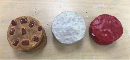
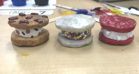
clay food project
|
|
- I believe my sculpture was neat and well executed. I made the cookies first and put thumbprints in them to show texture. I then made the ice cream based on the sizes of my cookies. Then I added the toppings, the sprinkles and white chocolate chips, onto the ice cream by scoring and slipping. I like the design overall for my food sculpture but some of the colors aren't the exact shade I wanted them to be.
- The hardest part of this project for me was the color of the ice cream sandwiches. I originally did two sets of the cookies a dark orange/brown color but one set was supposed to be red velvet flavored and the other set was supposed to be sugar cookie. I painted over the brown and the red came out fine but I couldn't get the shade for the sugar cookie that I wanted. Also, the color of the cookie dough in the ice cream is a bit darker than I wanted but overall I think it came out fine.
- I think my color choices did work well together. The colors I chose for the cookies, ice cream and toppings accurately reflect what the real food looks like. The colorful sprinkles and the red velvet cookies add a nice pop of color.
- My sculpture is interesting from all views. I made sure that all of the cookies had thumbprints for texture and no matter what way is facing, you can tell they are ice cream sandwiches. Each ice cream sandwich has a unique flavor of cookie and ice cream so they are interesting to look at.
- Texture is more easily done/shown on a sculpture because there are tools you can use to give you a certain texture. For a 2D piece, you can only create texture by using shadows, highlights and different shades/tints of a color. A sculpture also requires more attention to detail since the piece can be viewed from all directions.
- I created an uneven cookie surface by pressing my fingers into the clay leaving slight dents. I rolled little balls of clay and added them to the outside of an ice cream to give a realistic 3D effect of sprinkles. Ice cream in general is usually very smooth so I made sure that the surface of the clay was smooth and uniform.
- I believe my sculptures do look like real ice cream sandwiches. I tried getting close to the colors of the types of cookies I was creating. For the chocolate chip cookie, I tried going with a golden color and for the sugar cookie I tried to do a yellow/light brown color. I used glaze on the ice cream portions and white chocolate chips to give them a shine. The sprinkles are very colorful and added a nice contrast to a rather plain looking cookie.
- If I were to do this project again, I'd definitely spend more time creating the right colors for the cookies. I would also spend a little more time on the sprinkles; there were so many to do and they were very small so I was getting frustrated when painting them. The shades of the cookie dough and chocolate chunks in the ice cream weren't the exact color I wanted so I would probably fix that as well.
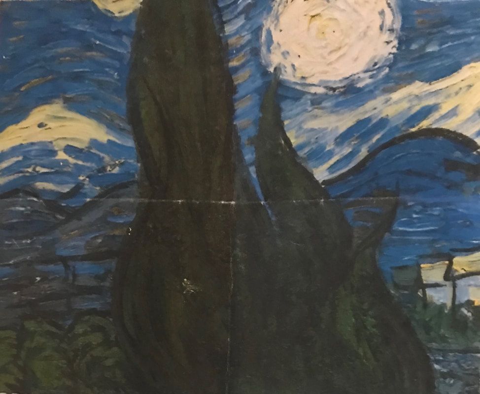
piece of painting
|
|
For this assignment, we were given a portion of a painting and had to copy it; the piece I was given was part of Starry Night.
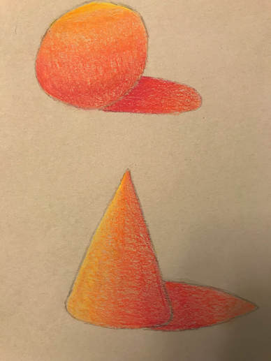
Acrylic color wheel and value chart
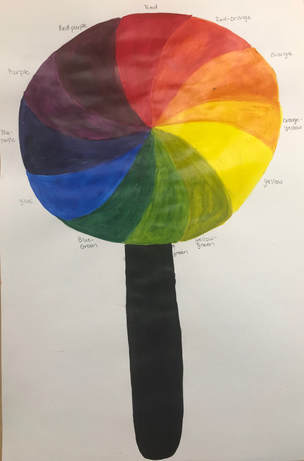
This is a color wheel using the primary, secondary and tertiary colors. I chose to do a lollipop because lollipops come in many different colors and flavors so I thought it would be cool to combine them all into one piece of candy.
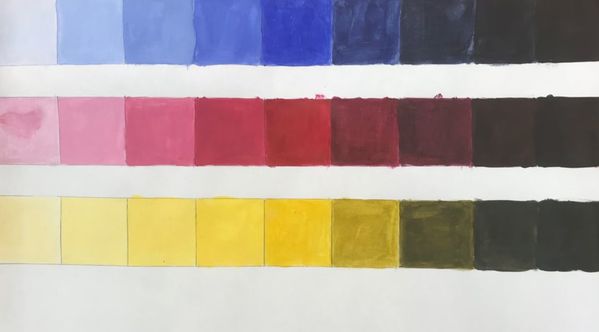
This is a value chart we created using blue, red and yellow acrylic paint. We went from the lightest tint to the darkest shade for each color.
primary color self portrait


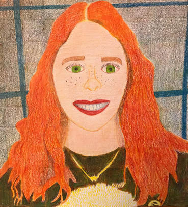
- I feel like my piece is neat and well executed. I went square by square when coloring but I feel like the colors are not very similar making the piece look segmented. Also the colors of my hair and shirt look good but not quite how I wanted them to come out.
- I had difficulty coloring my hair. It came out more orange than I wanted it and I had a hard time showing individual curls/waves in my hair. My shirt is a dark green color but you can still see individual lines of blue, yellow, and red; I had difficulty getting the same shade of green for each square. I also had trouble with the mouth- my lips came out very red and the dark spaces in my smile and the outline of the individual teeth came out very blue.
- I did draw each box separately which I feel helped the piece come out better. It is important to go square by square because it allows the person to focus on one thing rather than the image as a whole. By focusing on one square at a time, this ensures that the piece will be proportionate and come out like the reference photo or how the artist wants it.
- I created value changes with the colored pencils by adding more blue or red to the areas I wanted to be darker and more yellow to the areas I wanted lighter. Also, if I wanted an area to be darker and smoother, I would press the pencil harder against the paper.
- Luckily my hair is red/orange so I was able to easily get the color with the red and yellow colored pencils. The necklace I'm wearing was silver and the sloth hair on my shirt was white so I had to improvise and use the yellow colored pencil and the white of the paper. My shirt in the reference photo is a dark gray so I had to improvise and make my shirt green.
- I would improve my picture by adding more red to my hair and adding defined curls/waves. I would also take more time drawing my face by adding lines/creases, fixing my eyes, and fixing my mouth. I could also darken up some of the colors in my portrait to match my reference photo a bit more.
- I feel I was prepared for this project in the aspect of coloring with prismacolor pencils. The copying of the pictures from the magazines really helped me with the blending of colors. I don't feel like I was very prepared in drawing the face, but as this was the first face I've realistically drawn, I don't think I did too bad.
- I feel Tyler's portrait did a great job of mastering the techniques. She blended the colors in her hair so well that it looked exactly like it did in the reference photo. She showed the texture in her hair, eyebrows, and eyelashes very well. She did a really good job of showing texture on her shirt and on the car. She mastered skin tone; the skin in her portrait was evenly colored and effectively showed shadows.
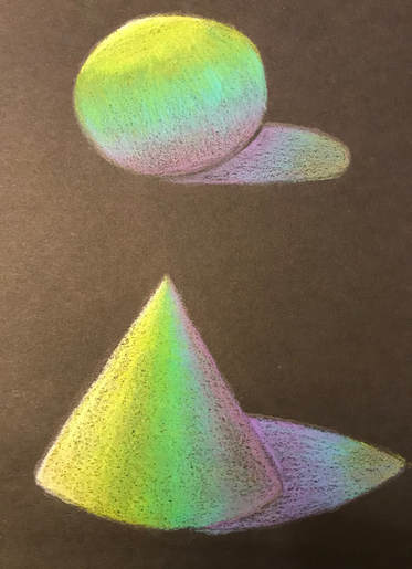
Prismacolor
|
|
We used prismacolor pencils on objects to help us wrap the color around the shape while displaying different values. I found that I was able to smoothly transition with the colors on the gray paper where on the black paper you could see the individual colors more.
|
|
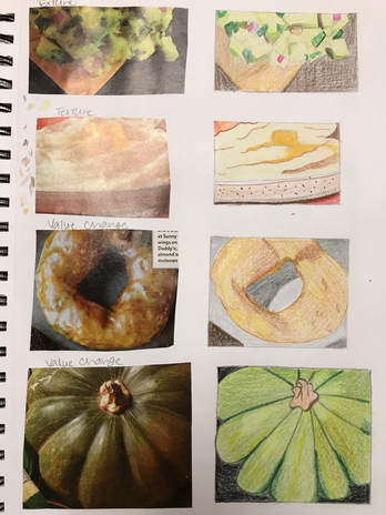
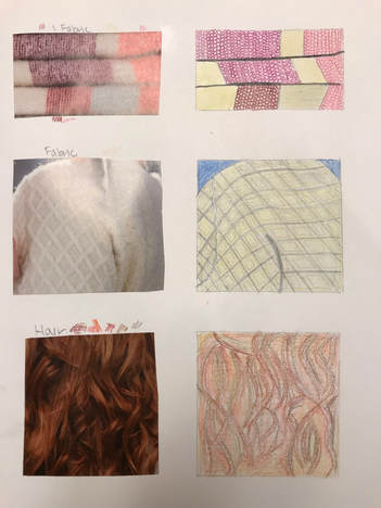
In this practice, we had to cut out pictures of a magazine that showed texture, value change, fabric and hair. While this practice allowed me to become more familiar with prismacolor pencils, I did not think I did very well matching the pictures.
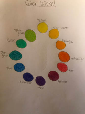
For this practice, we created a color wheel mixing different colors together. This wheel displays the primary, secondary, and tertiary colors and helped me effectively use prismacolors to get in between colors.
Watercolor final project
In Progress Photos
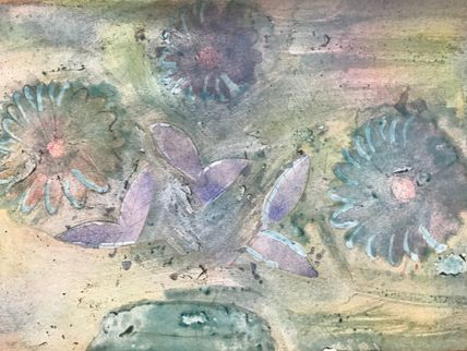
|
|
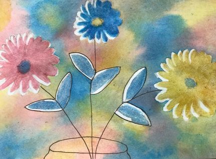
Final Piece
Self Evaluation:
- First I sketched the design I wanted. I added masking fluid in stages to work on each piece of my project. I started by putting masking fluid on the areas I wanted to be highlights on the leaves and flower petals. Then I sprayed my piece with water so it would allow the watercolor to move easily across the paper. Then I added the watercolor and moved the paper around to blend the colors together. I let those colors dry and added masking fluid to the areas I wanted to keep that same color. I slowly built up the colors on my piece while adding masking fluid until I got the colors I wanted. I removed all of the masking fluid at the end to reveal my final piece. I added pen at the end to outline the things I wanted to stand out.
- One difficulty I had was the background. I added two layers of watercolor to it but it ended up coming out as brown. I later went back and fixed it to give the color a more tie-dye effect. Also, I wanted the flowers to be a mixture of two colors but they didn't blend very well so I had to make them solid colors and the piece came out fine.
- One thing I learned was what masking fluid was and how to use it. I also learned that you have to start light and slowly build up the colors. Patience is definitely need when doing a piece of art. It took a lot of time for the colors to dry and I started to get frustrated when my piece didn't come out the way I wanted it to. One last thing I learned was that there is more than one way to do watercolor; you can pour liquid watercolor from a bottle onto a piece instead of painting with a brush.
- If we did this project again, I would choose a more challenging design to do. While I like the piece I did, it doesn't really show artistic ability and looks kind of childish. I would also add more detail to the jar the flowers are in.
- I used layering of colors in my piece especially in the background. I did several layers of watercolor to allow the colors to blend together. I also layered the colors of my flowers to make them darker and stand out from the background. I used texture to show that the flower petals and leaves weren't smooth therefore adding a realistic touch to them. My piece incorporated a lot of color that I felt was blended well.
- I felt like the mini watercolor lessons definitely helped me create a successful final piece. The lessons taught me how to add layers of color to effectively show value. They also helped me become more familiar with watercolor.
- I enjoyed having the guest artist in class. He showed us a new way to paint using watercolor. Also he showed us examples of his work which I thought was really cool. He helped us if we were struggling with a certain aspect of our piece.
- The guest artist showed me that patience is need when working on a piece or pieces. He also told us that we can sell our art because even though we may think it looks bad, others will like it and buy it. I learned that you can spray/splash water onto a piece to give a droplet effect.
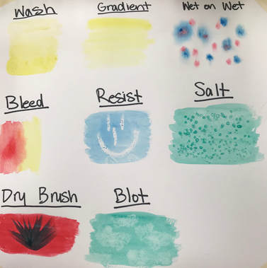
Watercolor Practice
These are peppers that I painted using different water color schemes. I wanted the background and table that the peppers were sitting on to be similar colors for all of the paintings. The first pepper is painted using cool colors and I added salt to the design. The second pepper is warm colors. The third pepper was colored with watercolor pencils. I liked using these because I felt like it gave as smooth a finish as regular watercolor does. The last pepper is painted using a monochromatic color, purple.
|
|
|
This helped me practice different techniques that could be used when painting with watercolor.
|
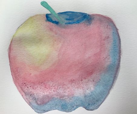
This is an apple I painted with watercolor. I didn't want it to look like a regular colored apple so I added blue to it and made the stem green. The blue was also used as the shadow/darker part of the apple and the yellow was used as the highlight.
|
|
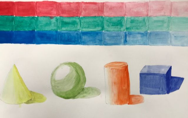
For this practice, we worked with watercolor in order to get a gradient effect. We also applied this practice to different shapes in order to show the lights and darks. |
pen and ink final project
Self Evaluation:
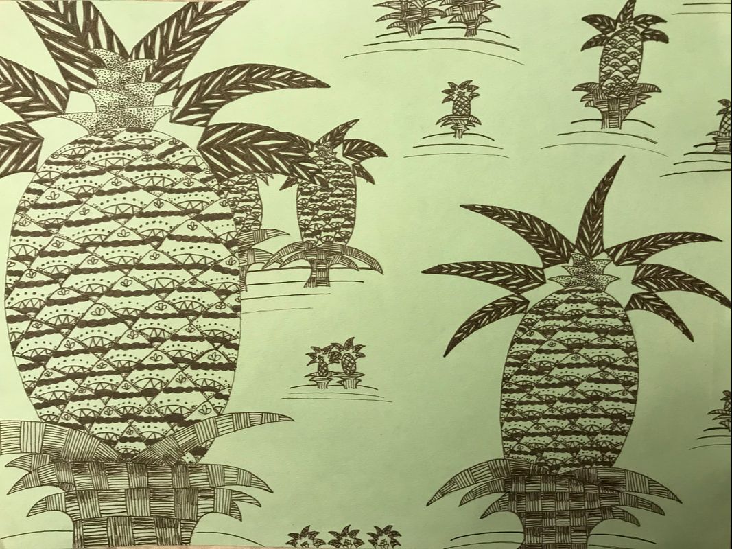
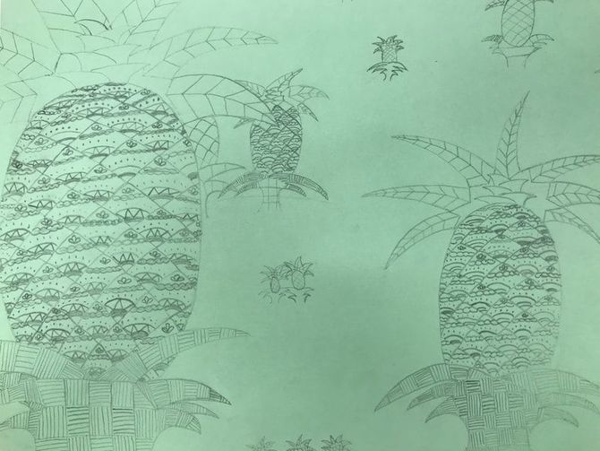
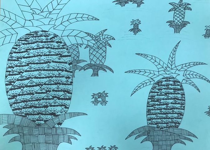
- I wanted the pineapple on the left to be the main focus but still have other pineapples of similar size. I have different sized plants to show that those are farther in the back. I started with the two biggest pineapples and placed others in the open space and cropped some of them so it looked like there was more of the pineapple off the page. I believe this is a successful composition; the biggest pineapple is the main focus but doesn't distract from the other fruits.
- Textures and patterns are important in my piece because I chose patterns that you don't usually see on a pineapple but still look like they could be on a pineapple. I chose the same pattern for each section of my plants to show unity. The farther away the fruit is, the less detail I added.
- Value is important in this project because it adds depth to the piece. I added value to show the overlapping of the leaves and scales of the pineapple. Also, the use of light and dark values adds a nice contrast to the final piece.
- My craftsmanship of this project could be improved. I was able to recreate the patterns for each pineapple and make them look the same. I could have added a bit more shading to the plants or more pineapples to fill in the empty space. My use of pen has definitely improved but I still have a lot to work on.
- By practicing different patterns, I had a wide variety to chose from to use in my final piece. The practice worksheets helped me be creative with patterns and also helped me be exact with my strokes. The practice studies helped me portray textures realistically. They also helped me show values in a pattern.
- It is important to understand the techniques taught in class because we learned about different patterns, specifically stippling and hatching, that have a major influence on my piece. If you don't understand these concepts, you won't be able to wrap a pattern around an object or show a value change properly.
- Thanks to the techniques we learned this unit, such as adding texture, my future pieces will incorporate these techniques and look more realistic. I have also learned how to add value to my pieces and this will help me show depth in the future.
- If I could do my piece differently, I would definitely add more to the background, whether it be more pineapples or a design. I would also change the pattern on my pineapple. While I do like it, I feel like it could be more detailed or could look better as something else. I would like to work on my shading a bit more as well.
Progress Photos
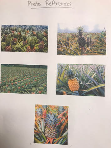
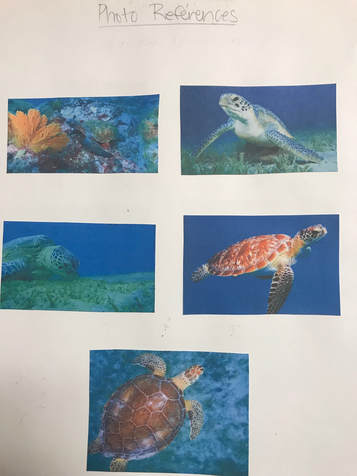
Reference Photos
|
|
Compositional Sketches
|
|
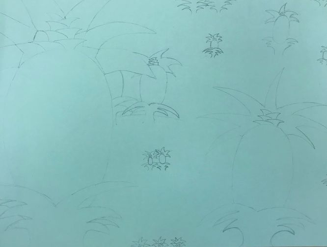
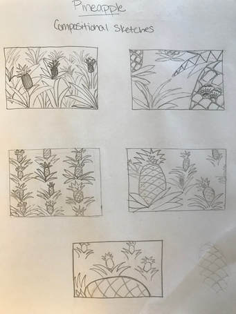
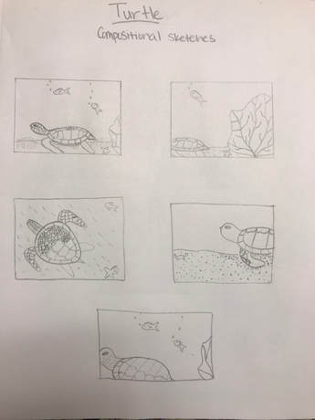
Once I had listed 20 different ideas for what I could do on my pen and ink project, I picked my two favorites which were the pineapple field and the turtle. I picked these because I felt like the shell and outside of the pineapple could have a very detailed design. I then got reference photos for each and made five compositional sketches.
landscape
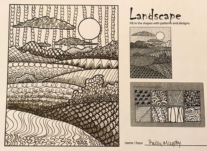
On this worksheet, we had to use different patterns in a landscape. At the bottom of a hill or mountain and where two objects overlapped, I made my patterns darker and smaller. I am not completely pleased with the sky and some of the shading but I feel like I have improved with drawing patterns and adding values to them.
100 Different Pattern squares
|
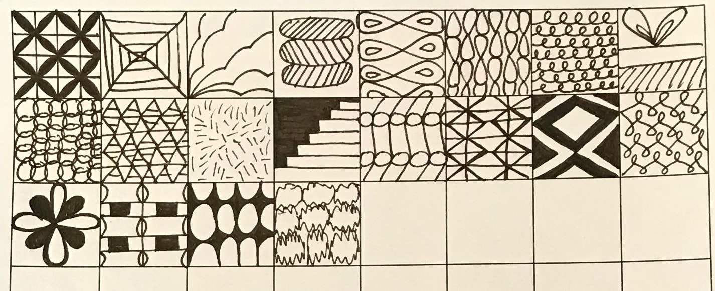
|
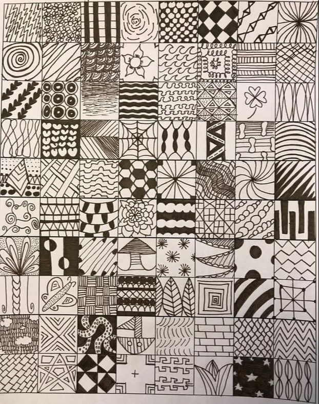
These are 100 different patterns using different types of values and techniques. It was hard to come up with 100 different designs but it challenged my creativity which I liked. I used some reference images of patterns to help form some of the designs I drew.
pattern elements worksheets
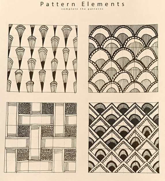
|
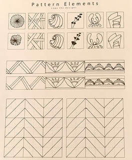
|
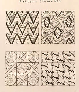
|
These worksheets allowed me to practice drawing different patterns and techniques. By copying the patterns, I was able to learn the repetition and applied it when drawing my own designs.
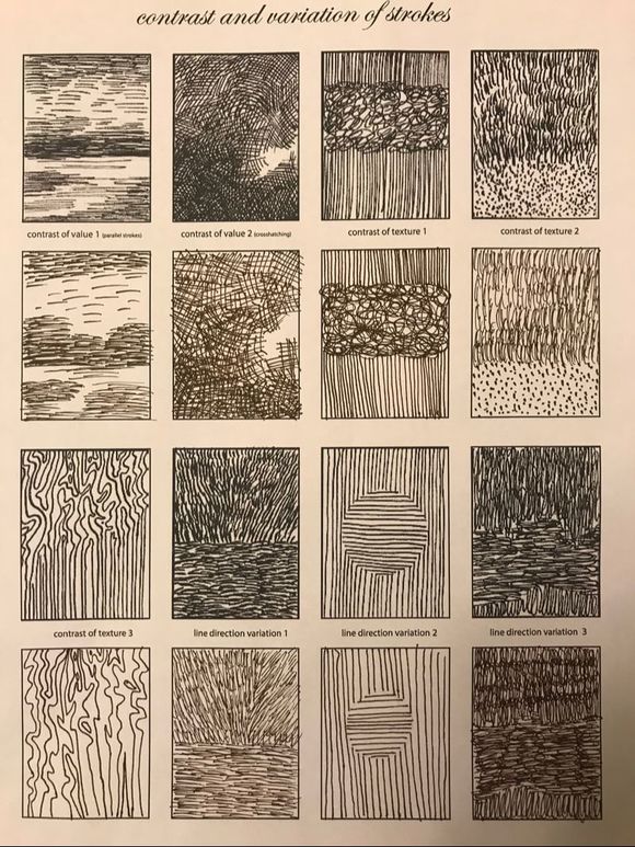
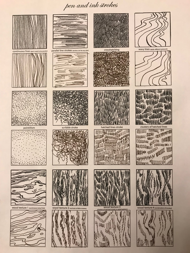
Pen strokes worksheets
|
|
These worksheets allowed me to draw using different strokes. Some of the textures I had not done before so it was interesting to try and draw them such as wood texture and the contrast of texture 3.
Shading and stippling worksheet
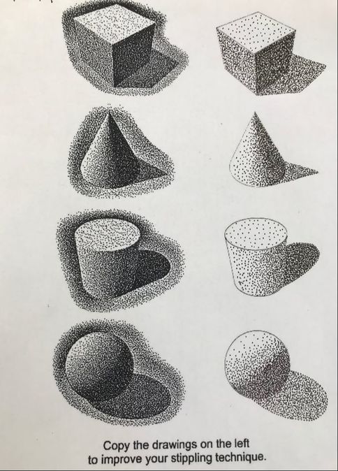
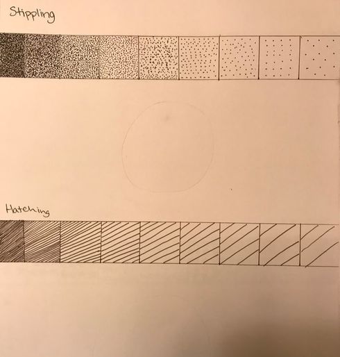
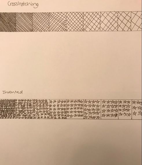
The stippling worksheet helped us practice stippling on different shapes to show values. I found it difficult to smoothly transition from dark to light but overall I didn't do too bad. We also did shading using different techniques including hatching, crosshatching and invented. The invented shape I used was stars. As the values got lighter, I used less stars and made them bigger.
Assessment drawings
|
|
|
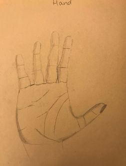
|
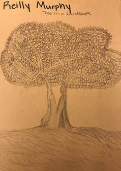
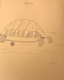
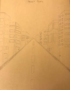
These are my assessment drawings. I drew a tree in a landscape, an animal, a street scene and my hand. For the tree, I started with the trunk and I tried showing the individual leaves. I then added the ground and added some shadows onto my tree trunk. For the turtle, I used a reference image. I added scales to the legs to show texture and lines on the shell to show scratches on it. For the street scene, I drew in one point perspective and included three main buildings on each side. I struggled with drawing the windows but overall I am satisfied. For my hand, I took a picture of it so I could be as exact as possible. I drew the outline of the hand first and then I added the lines and shadows.
